
Google Making Web Even More Mobile-Friendly

Google is Working to Make the Web Even More Mobile Website Friendly
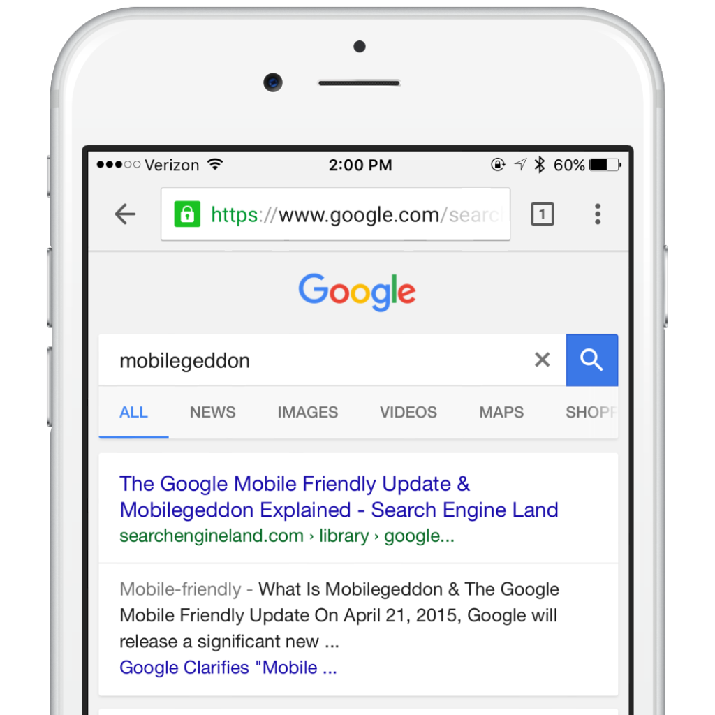
It was just a little over a year ago that Google released a significantly new mobile-friendly ranking algorithm. Referred to by some as Mobilegeddon, these algorithm changes have had a positive impact on mobile searches by helping mobile users quickly find what they are looking for. The algorithm changes can positively affect your business as long as you have a mobile website.
A mobile search conducted on an iOS device.
As Google works to make the web more friendly, they recently announced that in May they will be rolling out an update to mobile search results that increase the effect of the ranking signal. This will help Google users find even more mobile-friendly web pages.
When Google first launched their updated algorithm the update worked to boost the ranking of mobile friendly pages for mobile search results, which made it easier for mobile internet users to find quality and relevant results from their searches. In other words, websites that were optimized or built for mobile carried more weight and received higher rankings in search results. This allowed businesses who incorporated a mobile website or mobile friendly website to get their information in front of customers on mobile first.
One of the best parts about this new update is the fact businesses that have already made their site mobile-friendly don’t need to do anything. We listed a few tips for those who don’t have a mobile-friendly site or would like to check out how they can improve and existing site.
Building a Mobile Website
Building a good looking website is the easy part, but making sure it’s mobile friendly takes a bit more work. With online software suites like Duda, Weebly, and SquareSpace there are plenty of platforms that can help you create beautiful mobile-friendly websites with little or no experience. For those working with working with limited budgets incorporating a full mobile marketing suites may be better option. Mobile marketing applications like AvidMobile will provide you with a SMS marketing application, mobile website builder, and a variety of other mobile marketing tools. For those not ready to tackle building their own website, there are countless agencies and individuals who you can hire to help. Do your research and decide what works best for you.

Shutterfly’s mobile-friendly website provides an easy to navigate layout and highlights product offerings for mobile visitors.
How does your Mobile Website stand up?
Once you’ve built your mobile website or mobile-friendly website there are several things you can do to improve the mobile site’s performance. GoDaddy stresses to their clients that optimizing a mobile site goes well beyond SEO and a decent experience on mobile. As with anything else quality optimization is in the details. Automobile owners who want the most from their site take the time to do routine maintenance to ensure their car is running optimally at all times. The same is true for your mobile site. By spending a little time in several focused areas you can make sure your website is running at it’s best.
Here are seven ways to improve your mobile-friendly website.
- Run an analytics of your site. Google has made it easy to do so with their Mobile-Friendly Test. Simply plug in your url and see how your site performs when it comes to mobile.
- Do a tune up. You want search engines to be able to easily crawl your content.
- Take a test drive. Don’t push mobile media live without testing it. Sure, that content looked good while you were building it, but if it’s too small to read on a mobile device then it’s not going to do you a lot of good.
- Make sure your wires aren’t crossed. Avidmobile has a lot of users that redirect from their desktop to their mobile website. Make sure your paths are correct to avoid a poor user experience.
- Watch out for speed bumps. When a mobile user lands on your page make sure they can find what they came for quickly. Mobile ads and pop-ups to download apps can be distracting and sometimes even cause visitors to quickly navigate away.
- Optimize! With today’s technology capturing breathtaking images and 4k video is easy, and on a desktop website, this type of media is amazing. However if you’re desktop site is optimized for mobile you should think about mobile users. With carriers limiting data, and in extreme cases throttling speeds, hi-res images and 4k video can cause your site to load slowly. When choosing images and media smaller is better.
- Don’t forget your directions! Think about your url, if you use your normal url or ad “m.” before it Google doesn’t care. Choosing a completely different url will make a difference. Determine your needs and go from there!
Source: The Garage by Go Daddy
Final thoughts on Google’s updates and it’s impact on mobile websites.
For the first time in history Google reported that in May of 2015 the number of mobile searches exceeded the number of desktop searches. When building your mobile marketing strategy make sure you allow time to build and improve your mobile-friendly website. It’s an important part of your business and without it you’re most likely missing out on revenue.